Warm and saturated hues lead the new color trends!
Just like in fashion, colors in interior design run in trends, and that is a good thing. Much like in fashion, color trends in interiors allow us to design, furnish, and accent spaces in hues that are readily available in the marketplace. If not for that, it would be impossible for the consumer to find a pair of shoes or scarf to match an outfit, and equally difficult for the homeowner to find toss pillows and a throw to accent their room.
You may have noticed that home decor has pulled away from the grey that has dominated homes and decor magazines for the past ten or so years. We could not be happier about that. Having said that, the colors in interiors have taken an unexpected turn toward what seems at first glance to be a blast from the 70s. Warm golds, greens (think harvest gold and avocado appliances), but they are being introduced in a new fresh way.
First, a look at how the pros pick a neutral colour
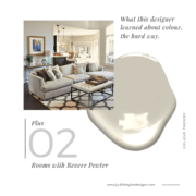
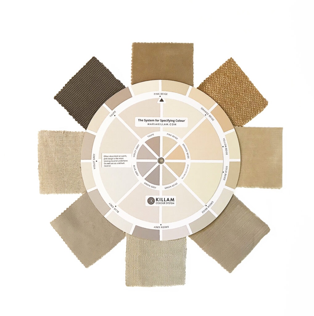
Whether it is paint, fabric, or the background of a wall covering, neutrals can be tricky to read. Really tricky. Enter the designer’s best friend, Maria Killam’s innovative color wheel and we can easily read the undertones of your hard and soft materials and specify the perfect paint color to complement your home.
Here’s a peek.
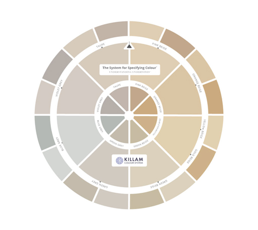
Below you can see how helpful it is to read undertones of fabric when selecting a paint color. It is equally effective for reading the neutrals in a countertop material, area rugs, and complex patterns. The goal is to determine whether your selection (carpet, fabric, stone, etc.) has a neutral, cool, or warm undertone before selecting a paint color to complement it. The cool undertones lean toward grey, blue, green, and violet. Warmer undertones lean toward gold, yellow, pink beiges, and taupe sits nicely in the middle.
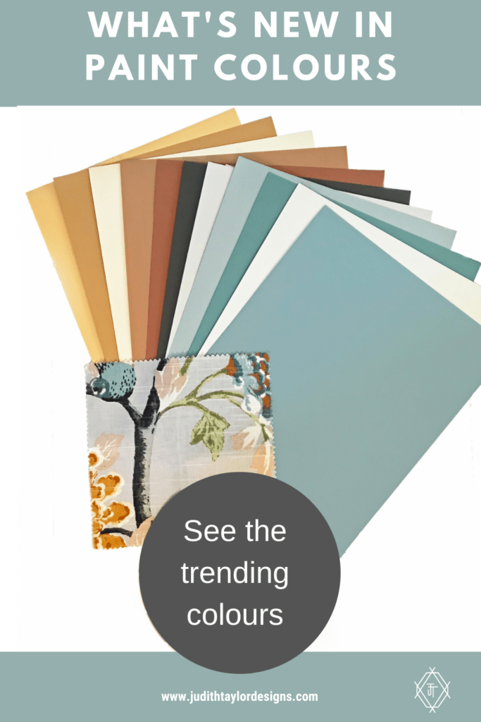
Neutrals will still have a place, and important place but here’s a look at the new colours just in! These will really liven up a space.
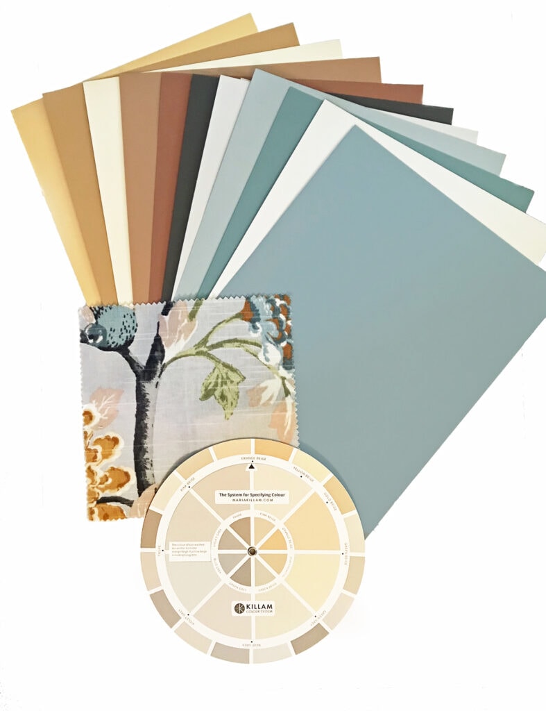
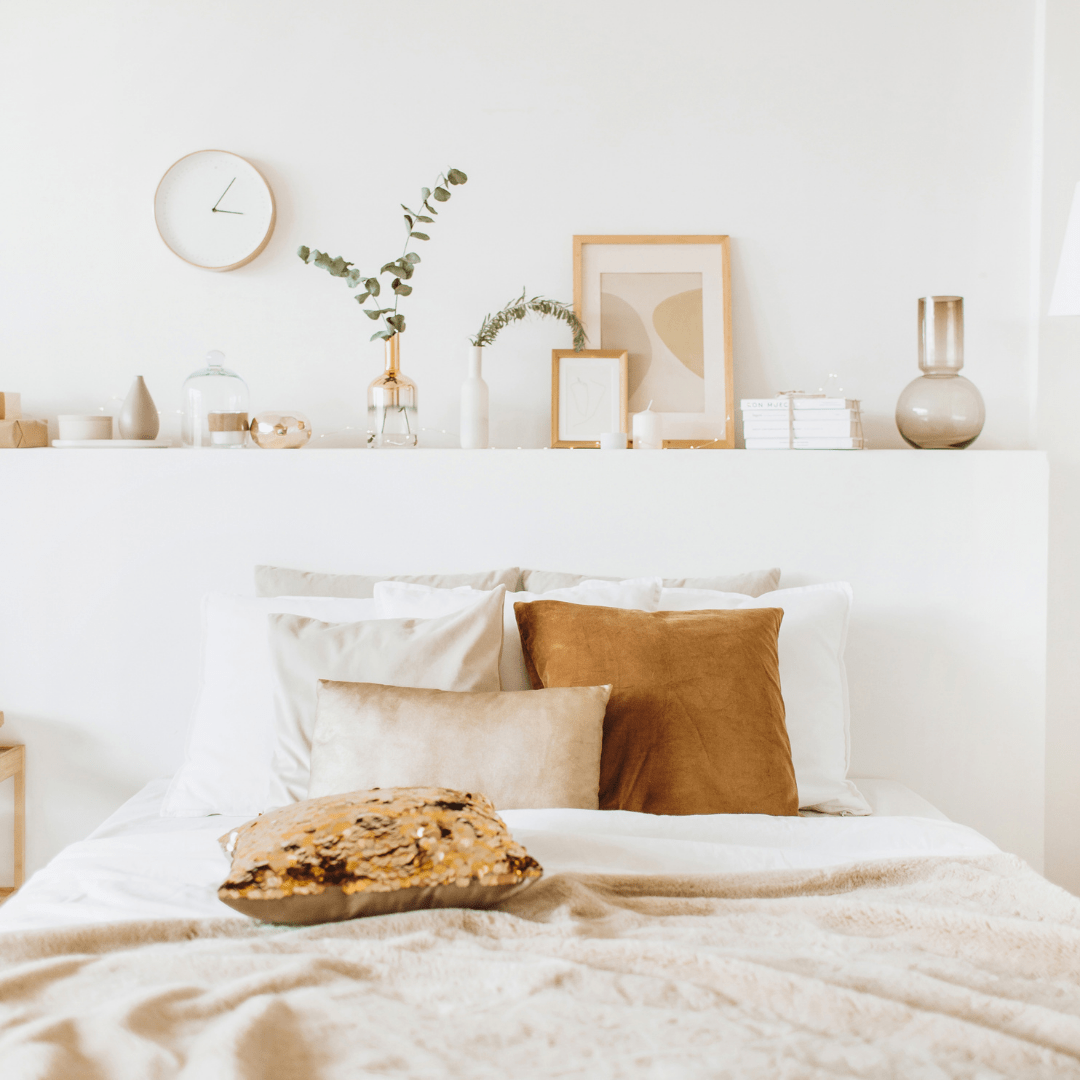
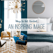
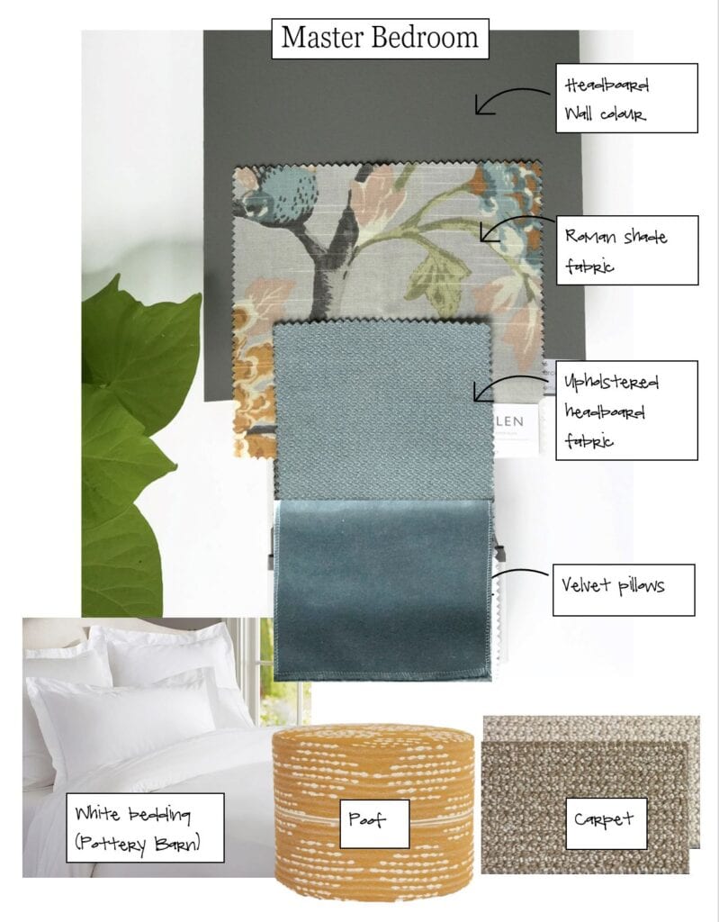
Here’s a pretty master bedroom scheme we put together recently for a client using this new palette inspiration. Almost any of the new hues would be lovely for this room.
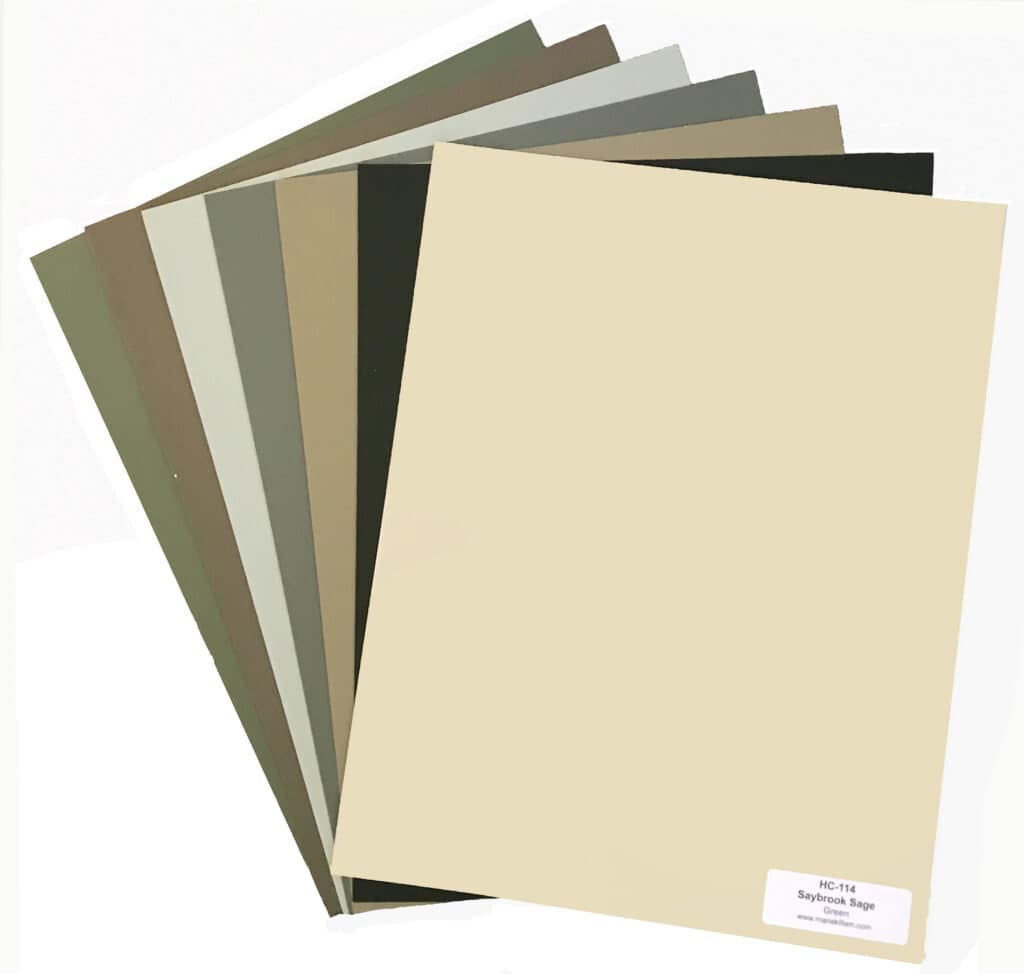
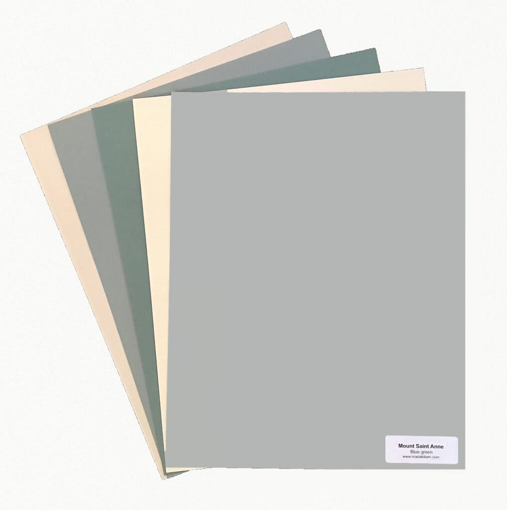
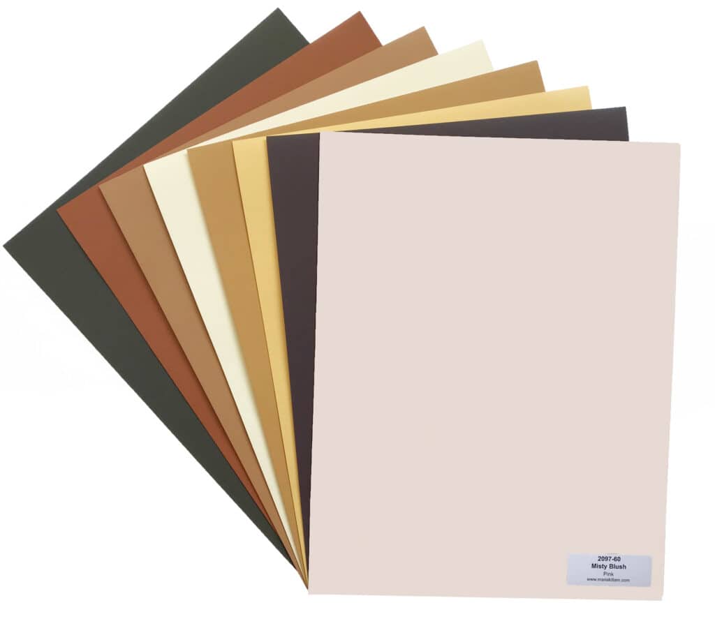
Below are some of the new color boards we just received. I can’t tell you how important it is to have a large sized sample when picking a paint color. We have professional size paint samples (11″ x 14″) for the most popular paint colors used and bring them to every color consultation. It really gives confidence when the paint color needs to be just right – which is basically every time!
Green is a big player this year…
Muted blues and greens make a great backdrop for a cozy room.
Gold and russet tones are welcome for the fall!
It took me a while to come around to the new color trends palette, but I love the sophistication of mixing warm with cool hues. This nuanced palette elevates the result from the harvest gold and avocado green from the 70s to a new level. We are excited to get you started.
Book a color consultation here if you need help!

