Not too long ago I was called for a consultation by a homeowner who needed help selecting a fabric to reupholster her sofa. Like many homeowners she started to update her living room on her own and got stuck…
Here’s what I found:

And then, not a word of a lie, within the same week, I visited another home on a consultation to help a client pick a new carpet for their home and found this:

It is actually a pretty common dilemma people run into so I thought it was worth writing a post about.
Lost in a Sea of Beige
The problem that both homeowners had in common was they were stuck in indecision between beige, beige, and more beige and had no basis for a decision. Other that wearability, and stain resistance treatment, they were many variations on a similar theme. No wonder they got stuck. They didn’t have any basis for preferring one over another.
Neutral Colours and Design
When I learned about Maria Killam’s theory on reading the undertones of neutral colours, it was eye opening. Mind blowing, really! After extensive training in how to read the undertones of fabrics, wall colours, hard surfaces like countertops and backsplashes, etc. I have come to know this colour chart below as my favourite tool. I have charts like this for greys and their undertones too. These are how we compare one neutral to another to see if it is going to bring out the best in another material or not. When the undertones flow, everything looks cohesive. When they don’t, usually one element or another looks tired or dirty in the mix.

How to Use Beige in Home Design
This, however, will only takes us half-way to the solution. It will help us to pick the right beige (or gray if that is the case), but the room will never come to life if everything is the same colour or range of colours. Varying the depth of a hue will help but in a monochromatic colour scheme you have to vary other design elements to make it all work. Ho-hum is not the desired end point.
So there are a couple ways to approach this type of design dilemma. One option is to find other fabrics that marry the colour scheme and add new hues, and the other approach is to look for an inspiration photo to create a vision for what you want the room to look like. In our client’s projects, we always have a big picture vision in mind for where we want to go with a room and then we find the elements to achieve that look.
Textiles
For the first homeowner, we selected a collection of textiles to draw from the colours in her rug, varying tone, pattern, scale, and texture to create interest. You can also achieve interest by varying shapes. Using interesting forms will enliven a room that has a narrow colour palette.
Here’s what we proposed as a collection for sofa reupholstery, accent pillows, and if memory serves me correctly there may have been another chair to recover.

A bit of pattern will go a long way alongside some texture…

Notice, that there isn’t a single solid in the collection. A subtle texture is as quiet as we offered. Violet is the compliment to gold so it adds subtle contrast. It would be so pretty in silk drapes for this room, and in velvet accent pillows. See how the patterns in gold-beige and cream add interest?
Here are a few inspiration shots showing rooms in beige with interest. In case you haven’t heard, beige is back and we are loving it!
It pairs well with navy …

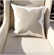
Blue and white or cream are a lovely way to freshen up a beige room, but it really makes a difference to add texture, pattern and interesting shapes to add interest. Neutral rooms really need this!

Taking beige to the depth of mocha creates range.

Graphic lines and texture create interest here. An adorable pooch doesn’t hurt!

Here, a masterful mix of depth and interest is achieved. Shaped bolsters and lampshades, a great variety of accent pillows in all different sizes and formats really break up the linear sofa. Skirted side chairs, an ottoman, and a tossed throw bring softness. Plants just take every room up a notch! This is when I really wish I had a green thumb.

Lush and plush, this monochromatic room is anything but boring.

Thom Filicia is masterful at creating charismatic spaces. I had the pleasure of meeting him at the Interior Design Society’s National Conference this spring in Palm Springs. What a gracious and gentle man! This vignette from his collection shows how powerful shape is as a way to add interest to a room.

Barbara Barry shows us how powerful form and texture can come together to create a dynamic result with one colour.
Now don’t let this mislead you. I still LOVE COLOUR. But if you prefer a more restful palette, there are many ways to add interest. Beige can be anything but boring!







Well done!
Thank you! There were so many lovely pieces to choose from but I am eager to see some elegance come back after an era of industrial chic!
Thank you. Neutral room sare tricky but fun to work on.