I was recently invited to participate as an industry expert in a live discussion on paint colors. There was so much good information that I thought I would share some answers to questions I am often asked.
Get your paint color right and avoid costly mistakes
I love residential design. I love it because I think what you surround yourself with shapes your experience and mood. I enjoy creating a personal experience for my clients and I am always inspired by what they love – artwork, family photos, an heirloom rug or humble elements such as a personal collection. These things give your home meaning. Color plays a vital role in design. It is the key element in setting mood and style – whether bright and energetic, or muted and ethereal, it shapes our experience and mood.

What’s the most common mistake people make when selecting colors for a room?
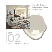
I find people often pick a color they like from the paint chip, and that doesn’t translate into the wall color they anticipated. Neutrals are the toughest because beiges and greys all have an undertone and it takes a trained eye to read those accurately. Another common mistake is not sampling paint properly. You need to have a large enough sample, and to place that sample properly in a way that you can isolate the color. Paint and pigments are a matter of physics and the science of optics. People will often choose from a small swatch laid on a table. It can completely transform when held on a vertical plane as the light refracts/reflects off it differently. Just try it yourself! Also, selecting the correct color will depend on its surroundings. A paint color in a room will read very differently depending on whether the room it is facing north, south, east, or west. Context is everything. For example, I talk about exactly this when I show how the same paint color looks very different in two spaces. Fun fact, this was Benjamin Moore’s top paint color at the time. People bought it for the name, not because it was the right color for them!
Whether you are painting a piece of furniture, or the wall, the same principles apply. Hint: if it looks bright on a paint chip, it will look much brighter on the wall!
People hear a lot about warm or cool colors. Can you tell us what that really means and how someone can tell what they are looking at?
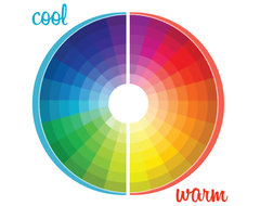
Simply put, warm and cool colors refer to the color wheel. Warm colors range from red through yellow. They tend to be more cozy – typically the colors of flames in a fireplace. Cool colors can be crisp and calming. They are more likely to be seen in water and ice. Have you ever noticed that an iceberg is blue? The tricky part is in selecting neutral mixtures because there can be warm or cool undertones. These can best be recognized by comparing them to others in the same neutral family. Again, color is all about context.
What three basic tips could you offer to someone planning a palette for an entire home?
Three simple tips anyone can follow:
- Work with colors you love. Find elements you love such as artwork, textiles, a beautiful carpet for the room you spend the most time in and draw a color palette from those, varying the tones from room to room.
- Create flow from one room to another by choosing colors that relate well to the first room and may be drawn from the inspiration (art, rug, textile etc.) for the first room.
- Try to repeat a color from the previous room such as an accent color and build on that for the next room thus creating a palette that is all related while creating interest.

White ceilings seem to be a very common “rule.” What is your take on that?
Never overlook the fifth wall. I love color on the ceiling. In one of my favourite projects the walls were all art gallery white – straight out of the can with no pigment at all to provide a context for the artwork. What added warmth was a coat of sunny yellow on the ceiling. When you walked in you didn’t say “What a crazy yellow ceiling”, you just had a wonderful feeling that it is sunny in here. Blue is lovely on the ceiling for the same reason – but use it with subtlety. If you are working with neutrals, add a bit of the wall color to the ceiling color to create flow from the walls to the ceiling. It creates a very sophisticated result to envelope the space with a color. Here are a couple of examples of blue ceilings used tastefully.
What current trends have you seen developing when it comes to color in the home?
I try to avoid trends. Following trends is the fastest way to have a room feel dated. I draw inspiration from whatever my clients love whether it is a textile or perhaps a beautiful carpet and try to ignore what is trending on the market. The best way to create a truly custom result is to develop a palette unique to that the client.
White interiors have been going strong on social media for some time, but our clients hire us for a result with character and personality. We like that!

How important is it for a home’s exterior color to mesh with the interior palette?
I think exterior color sets the tone. It gives the viewer an idea of what lies within in terms of style and overall color palette but certainly doesn’t have to match. Have fun with the door color – it should beckon!
What comes first, choosing the furniture or the wall colors? What advice do you have for homeowners who like to change their furniture/wall colors often?
Wall color should always be the last choice made. Benjamin Moore, for example, has several thousand colors just so you can find the perfect hue to complement your sofa or whatever you need it to complement. Changing furniture is costly, repainting the room also takes time and can be costly in terms of upheaval in a well-used space, but considerably less. Always start by selecting the most costly items. They are your investments. Then find the perfect paint color to flatter them. I encourage clients to create interest by switching up accents like accent pillows and accessories seasonally. A nice slipcover for the sofa can create a more relaxed look for the summer to add fresher colors to. Then for the winter revert to the original upholstery. You will love the space for much longer if you switch up the less expensive elements this way.

How can someone use color to create a mood in a home? Any tips for evoking the right feeling?
You can create quite a different feeling in a space depending on whether you choose colors that are clear or muted, lively or subdued. A specific hue such as blue for example can be very classic if it is a quiet neutralized blue, or intense if it is a clear brighter blue so you need to know the mood and the overall effect you are trying to achieve. A mid-century modern palette would be quite different than a historic Georgian palette, and Victorian would be different again. You have to be respectful of the structure you are working in or it just won’t work.
What’s the worst color disaster you have ever encountered? How did you address it?
Oh I love to admit in the 1980’s when everyone was in love with dusty rose I picked a disastrous shade of bubble gum pink for my first apartment. It cost so much to repaint it the correct hue that I learned everything I could about hues, tones, tints, and neutralizing a color so I would never make that mistake again. And I never did! Selecting colors is however still tricky. When the color is right, everything looks more stylish, richer. When the color is wrong, everything seems to look cheap.
Are you loyal to a particular brand of paint when selecting wall colors? If so, what is it that makes you such a fan?
I love Benjamin Moore colors. If you can’t find the right hue there… well, you just can! They have every possible mixture imaginable. However, I also particularly love the complex hues of C2 paint. They are so rich and nuanced they give a luminosity no others can match. Their finely ground artist-grade pigments create unmatched depth and vibrancy. They are the first North American paint company to use a European 16-colorant tinting system rather than the 12 used by most others. This complexity enhances color intensity and coverage even when using a soft neutral.
Do you struggle with choosing between 3 shades of a paint color and get stuck there?

Psssst! We’ve made it easy for you to save this. Click the Pinit button (on the top left corner when you hover) to save it for later.











Great article. It costs enough to paint that I would really like to get the colour right the first time!
Good point Kim. It is easier to get it wrong and waste a lot of money repainting.