
Seasons come and seasons go and along with them are the trends in fashion and interior design. Although most of you will know I am not a fan of jumping on the hot trends, instead I recommend sticking with classics, there’s nothing to say you can’t keep your room looking current without diving all the way in. Small accents are a great way to keep your decor up-to-date.

If you have ever wondered how the colour of the year is selected, a panel of experts from various industries gather and reflect on their work and their travels. Through a process of looking at factors like fashion, culture, art, and design the forecasters collaborate to envision an environment we will want to create in our homes.
The colours for the past few years have left us all uninspired. I mean, simply white, really? This year we have a fresh new palette with some really pretty hues. Here’s a look at what you will be seeing in the showrooms and magazines over the next year.
Benjamin Moore’s 2021 Colour of the Year
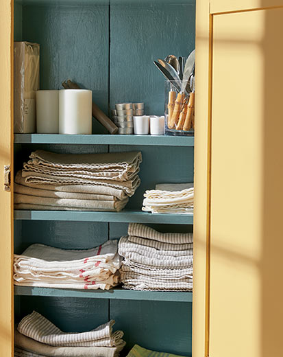
This year, Benjamin Moore has announced Aegean Teal for their colour of the year, a soft approachable hue that exudes a harmonious feel. Couldn’t we all use some of that right now?
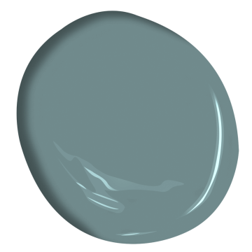
Aegean Teal 2136-40
I found these lovely percale sheets in this hue you can order here, as just one way you can add a touch of this pretty hue to your bedroom.
Aegean Teal
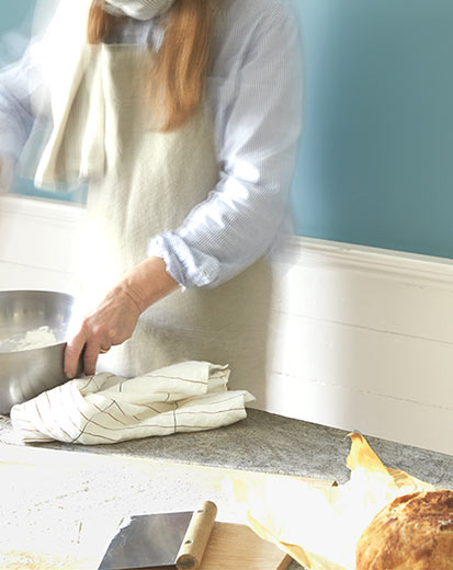
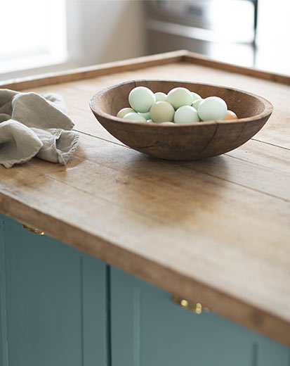
It’s a beautiful balanced blue-green with a touch of gray that hits all the right notes: not too light, not too dark, too cool, too warm – what’s not to love? Picture it in a setting with gauzy flowing white curtains, rumpled linen sheets and towels, and a hand carved harvest bowl filled with freshly collected eggs and you will get the right image. All the lovely images are courtesy of Benjamin Moore.
The complete palette is soothing and warm. A favourite to pair Aegean Teal with is the buttery Beacon Hill Damask
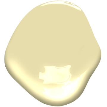
Beacon Hill Damask HC-2
Here’s the full line-up of their trends palette. There are some lovely warm hues that all work together to support or accent to this colour of the year, or stand on their own.

Here are some ways to use this lovely hue:
- Pairs beautifully with natural fibres like sisal, seagrass, hemp
- Adds a note of warmth when paired with cooler hues like charcoal
- A versatile colour that works well on cabinetry, furniture or a front door
- Perfect for a feature wall when you need a pop of colour
- Looks lovely when paired with the new direction toward light wood flooring and furniture
- Compliments brushed brass, silver black and other metals
- Pairs beautifully with neutrals – greige, off-white, ecru, and the rest of the COTY 2021 palette
Here are a few things I found that would add some of this colour, or accent it if you already have this in your home. As usual, you can click on any image to learn more or to order if you see something you like.

Here’s a pin so you can save this for later…


*** My standard disclaimer: Please note, some of these items may be offered through affiliate links which means I could get a small commission if you order. That will never influence what I find lovely and want to share with you. I always offer suggestions I would buy for my home or recommend to a client. Also, rest assured it won’t affect the price you would otherwise pay.